|
eValid™ -- Automated Web Quality Solution
Browser-Based, Client-Side, Functional Testing & Validation,
Load & Performance Tuning, Page Timing, Website Analysis,
and Rich Internet Application Monitoring.
|
|
eValid --
Using 3D-SiteMaps to Identify Good and Bad WebSites
eValid HOME
Introduction
eValid's 3D-SiteMap charts
make it very easy to gain deep understanding
of how a WebSite is constructed.
With a little practice it is easy to determine good and bad structures from these pictures.
How does your WebSite compare?
About 3D-SiteMap Charts
eValid 3D-SiteMaps are generated by
eValid as part of Site Analysis runs.
Each chart is a complete presentation of the WebSite dependence
information also given in tabular form in the Site Analysis Reports.
The 3D-SiteMap display is completely dynamic, in full 3D, and adjustable under user control.
This format makes it easy to study how pieces of a WebSite or a Sub-WebSite are connected and
how they interact.
There are some pre-programmed dynamic 3D-SiteMap examples available.
Guidelines
What makes a good WebSite structure and what makes a bad WebSite structure?
How does WebSite structure affect usability?
How does it affect performance?
Can you identify problem WebSites by studying their structure?
What kinds of structures do you try to avoid?
There is no best form of WebSite structure nor is there any worst structure.
Even so, there are general trends and with a little practice you can easily identify some of the
structural features that present the biggest challenge to user friendliness, usability,
and delivered end-user performance.
Here are some intuitive rules that address these questions.
(See also the examples.)
- Limited Connections
More connections from one page to another are NOT necessarily good.
Too many selections may be a problem.
You see this with excessive connection lines.
- Clustering
Clustering of the dependence between small groups of pages generally means
that that topic is well isolated from other parts of the site.
- Excessive Images
Too many images connected to a page may imply a problem in readability as well as download performance.
- Compactness and Cohesiveness
Each sub-WebSite needs to be compact, cohesive,
and generally focused on one topic.
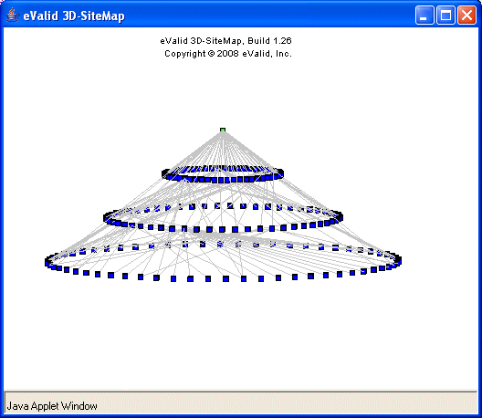
- The Galaxy Model
An ideal WebSite probably has its pages organized into clusters ("galaxies")
with each cluster generally focused on one subject area.
- Link Overload
Beyond an average ratio of about 10-20 links per URL
you could say there are "too many selections".
The only way this works is if there is a good structure
that makes current content (subject focus)
separate from the selection of alternatives.
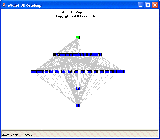
- Excessive Dependence
With the exception of images or outbound communication pages,
which correctly may be reference by many pages,
it generally is a bad sign if a page has a
very large number of inbound links.
- Image Links
If a page has a lot of images there is a higher chance it will have errors.
Try to avoid too many images linked into a page.
- Performance Problems
If some of a pages images are very slow-loading -- because the files are large
or are served from a different machine than the base page --
this can affect the users' experience of WebSite reactivity.
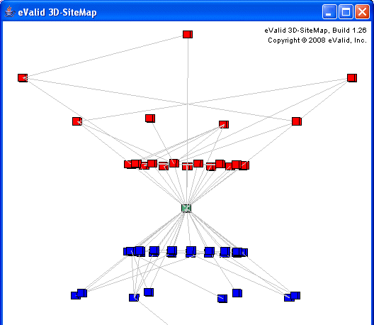
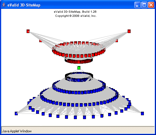
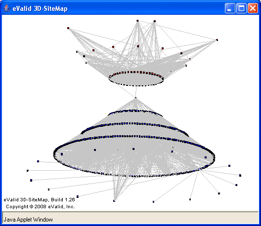
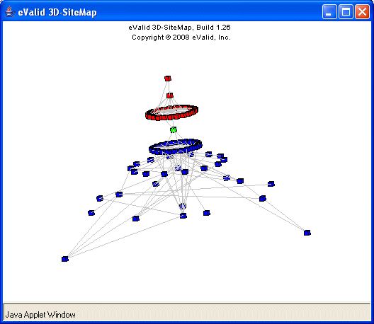
- Hour Glass Shape
If one page has a lot of parents and a lot of children, but the none of the parents are also children,
the resulting 3D-SiteMap resembles an hour glass.
Generally this is a good structure because it suggests that context has been focused effectively.
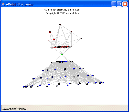
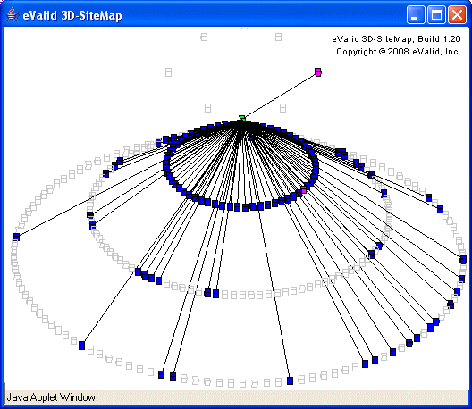
- Traffic Director
If a page has a few incoming links and a lot of outgoing links, this is a traffic director or
pivot page.
If this page is not too large this is a good sign because it will help the user speed up the
choice of a useful page.
Remember, these are only guidelines; there are always exceptions!
Your own experimentation -- and comparison of your WebSite structures with
those of others -- will help you develop your WebSite quality sense
Illustrative 3D-SiteMap Examples
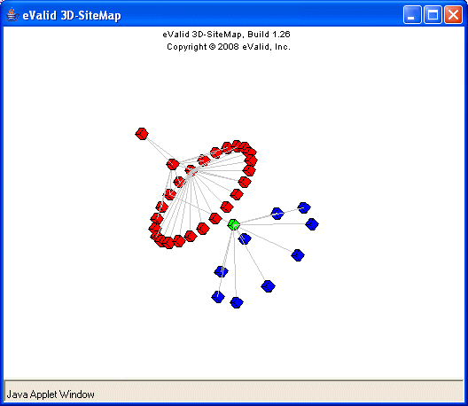
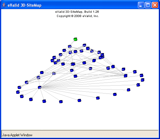
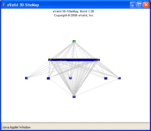
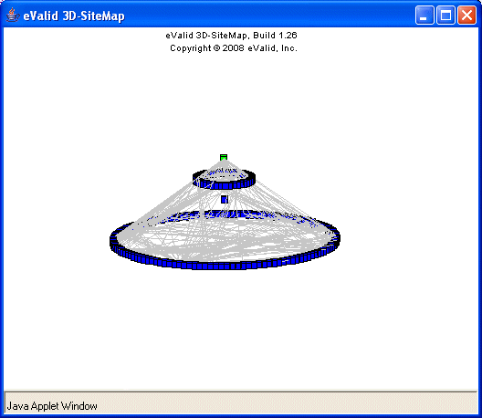
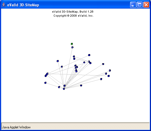
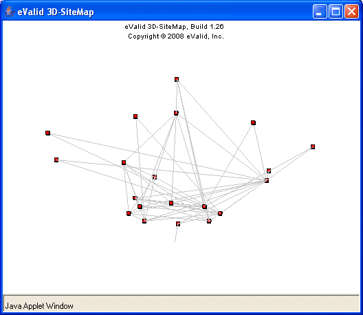
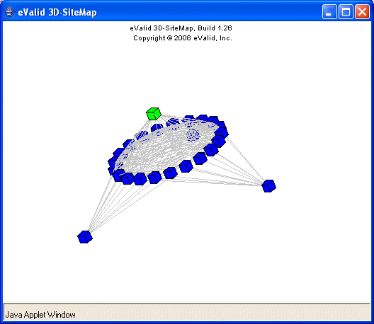
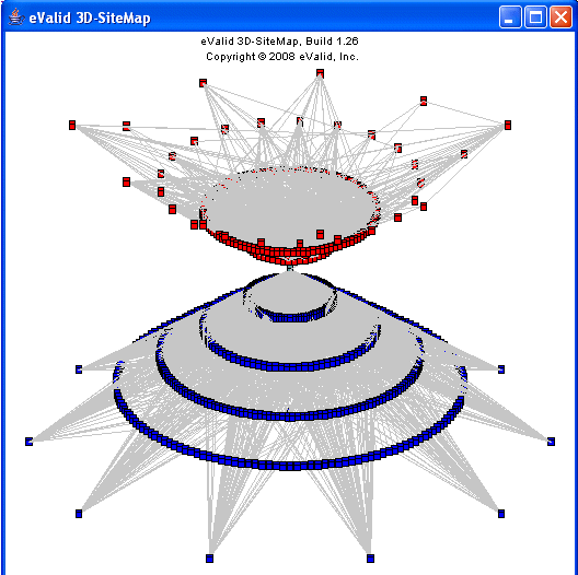
Here are examples that illustrate the guidelines described above.
| Type | Example WebSite 3D-SiteMaps
|
| Small | Medium | Large | Enormous
|
Good
WebSites
| 
| 
| 
| 
|
Marginal
WebSites
| 
| 
| 
| 
|
Bad
WebSites
| 
| 
| 
| 
|
Awful
WebSites
| 
| 
| 
| 
|
Guideline Descriptions
